Users love attractive and cool-looking features in the applications, so today we will learn how to create a super awesome yet easy-to-implement 3D product screen in Flutter.
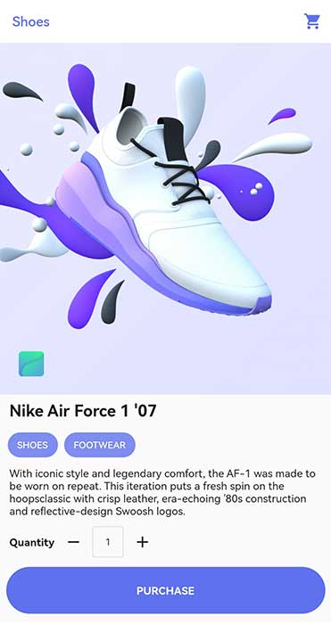
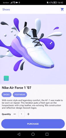
Here is the final version of the screen that we will build:
Requirements
Before we jump to the coding part, we will need a 3D model of our product screen.
For that purpose, we will use Vectary as it offers free-to-use 3D models.
After you create a new account there, you can pick any 3D model you want but in this article, we will use a 3D model for shoes.
We can pretend that those are new shiny Nike shoes.
With help of Vectary users can rotate a product vertically and horizontally, and also zoom in and out. Here is a little GIF of how it looks in action:
After you are done with your registration, and picked your 3D model, you can click on the share button and copy the URL to your 3D model.
Widgets
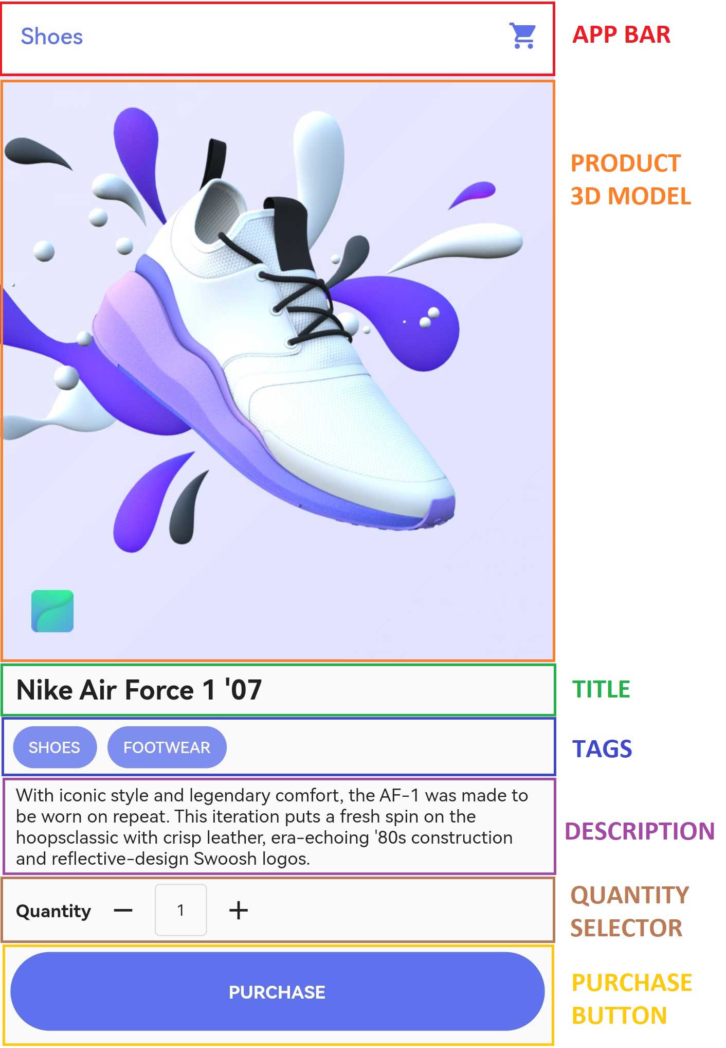
Now before you start coding you should always analyze the design and visualize how you are going to dissect the structure into widgets.
Widgets are small reusable chunks of code, similar to components in React, Vue, or any other web framework.
Here are the widgets that we will need to build for our product screen:
Project setup
Now we can start with our project setup.
Open the command line, and hit this command to create a new flutter project:

As we have a web URL for our 3D model that we need to display, we will need to install a package called webview_flutter in our project.
To do so, we need to navigate inside our shoes_app project and execute this command:

If you try to run your project you will probably encounter some errors as webview_flutter requires compileSdkVersion to be at least 32 and minSdkVersion to be at least 19, so you can go to .\android\app\build.gradle the file and change these to fix the error. The application should build successfully now.
Finally, to have a clean start, we can get rid of the starter code and make our code main.dart looks like this:
Here we added a couple of constants that we will pass down to the appropriate widgets.
We also defined a blue theme for our app and a custom blue-ish color for our icons, tags, and purchase button.
As our product description string is quite large, we split the string to take less space horizontally and it’s a neat trick to make your code look a bit cleaner.
The string will be displayed usually in the app as this doesn’t change it.
App bar widget
Now we can create a new file app_bar.dart where we will create our custom app bar widget:
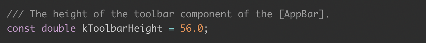
To make your own custom AppBar you have to add with keyword for PreferredSizeWidget mixin as you need to tell Flutter what is the height of your app bar.
To do so, you must override the preferredSize getter and set height. In this example we won’t change the height, so we will use the constant kToolbarHeight which is already defined in the Flutter.
If you do cmd + click, it will take you to the source code of material.dart and there you will see this:
The rest of the code is pretty straightforward. We pass the text parameter which will be our app bar title and color parameter which will be used for the color of the shopping cart icon on the right side of the app bar.
ProductText widget
Now we will create a new file product_body.dart where we will have the rest of the widgets for our screen.
After the widgets are finished we will just use them and return the complete product body.
Here is the code for our ProductText widget:
Nothing special here, we pass the title in the text parameter and give a text a bit of breathing room with Padding widget.
As we plan to use this widget for product title and product description, parameters fontSize and fontWeight are also added so that we have flexibility.
By default fontSize will be 16.0 and fontWeight will be FontWeight.normal.
Tags widget
A product can have multiple tags, usually 2 or 3, so we pass a list of strings for product tags and color for the background color of those tags.
This is what our Tags widget code looks like this:
We use .map() function to map our tag text into Chip widget and spread operator to put those Chip widgets as a Row children.
Color is also tuned down with .withOpacity() function.
QuantitySelector widget
This one is a bit different from other widgets, as this one is StatefulWidget, which means that it holds some data for us.
In this case, it is a quantity that the user can increase and decrease.
Here we are using Row widget so that we can position the text “Quantity”, decrease the icon, and current quantity value, and increase the icon next to each other on the X-axis.
We also have 2 onPressed event handlers decreaseQuantity and increaseQuantity which are executed when the user presses the IconButton.
In decreaseQuantity we decrease quantity by 1 each time IconButton is pressed. The limit is 1, as a user should not be allowed to go to 0 or negative values.
The function increaseQuantity is doing the opposite thing, it increases the quantity value with no limits.
Both of these functions use setState() function to reflect the changes in quantity value on the UI.
PurchaseButton widget
The purchase button is a simple widget for a user to confirm his purchase
To make a nice wide round button, here we use InkWell widget to listen for onTap events, while Container widget is used for creating border radius and background color.
We also reference onPurchaseHandler function in this widget, together with color for the button.
ProductBody widget
This widget is the core of our screen. We use here all previously defined widgets to create a product body.
Here we use NeverScrollableScrollPhysics to disable scrolling for users.
This is because of the WebView widget so that users can zoom in and out and rotate the product 3D model that we display in web view.
Apart from that, everything else is pretty straightforward.
There is a Column widget as all other widgets is ordered in the Y axis from top to bottom. For product title, we pass bolder font weight and larger font size.
HomeScreen widget
Now that everything is created we can just use ProductAppBar and ProductBody widgets to finish the product screen.
Final thoughts
That’s it, the whole screen is finished.
This is the version focused on UI, sure there could be a few improvements for responsiveness and other tweaks but for this use case, it should be enough.
If you need a full code, you can find it here on GitHub.
Enjoy!