You’ve spent weeks building a cool app. The backend's solid. API’s lightning fast. You’re feeling good. Proud, even.
Then someone tries it out and say the one thing that hits harder than a bug crash:
“Uhh... I don’t get it. What am I supposed to do here?”
Ouch. Suddenly, all that hard work feels invisible. Why? Because if people can’t use it, they won’t care about how well it works.
Here’s the thing: clean code and smooth performance matter. But great UI/UX? That’s what makes users stick around.
So, being a full-stack developer doesn’t mean you can skip UI/UX. Actually, if you handle both front and back end, you’ve got zero excuses for a clunky user experience.
There are literally hundreds of design principles out there, but you don't need to learn them all.
Just nail these 10 simple UI/UX principles, and people will enjoy using what you build.
Ready to build interfaces users love? Join Index.dev today and get matched with companies that value your UI/UX skills.
1. Clear Always Wins
You added a button that looks like a tiny rocket ship.
Cool? Maybe.
Obvious? Nope.
Turns out, that button was supposed to “log out.” But your users thought it launched... something. And now they’re stuck, confused, and slightly annoyed.
If someone has to guess what something does, it’s already bad UX.
Don’t get fancy with icons or words just to be different. Use what people already know. Use icons people recognize.
- Use a simple "×" to close things.
- Put that predictable shopping cart in the top right corner.
- Use a gear icon for “settings.”
Standard icons, simple labels. Don’t get cute, get clear. You’re not designing a puzzle. You’re building something people should get in a split second.
SIMPLE beats CLEVER. Every. Single. Time.
2. Make It Stupidly Easy
If someone has to stop and think, you’re already in trouble.
People don’t read instructions. They tap, swipe, and scroll fast. If they get stuck for even a second, they bounce.
Would you want to fight with an app when you’re tired, hungry, and just trying to order a burger?
Exactly. Neither does your user. Remember – your users aren't stupid, they're busy. They have jobs, kids, and a hundred other apps competing for their attention. Every extra step, every odd button, and every extra second they spend confused is another reason to bounce.
So before adding anything new, ask yourself: Would I get annoyed using this when I’m tired or distracted? If yes, scrap it.
Keep things obvious. Make buttons do what they say. Don’t hide stuff behind five clicks.
Your job is to remove friction. Let users breeze through without a second thought.
The less they think, the more they’ll use it.
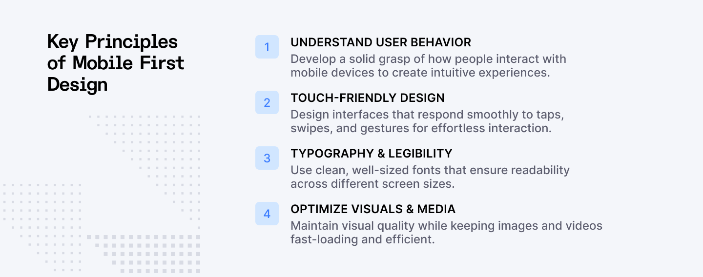
3. Mobile Comes First
You know where most people are using your app? Not at a desk with a giant monitor and perfect WiFi.
Most people are using your app one-handed… while doing something else. Probably in the bathroom. Maybe in line. Definitely on their phone.
That’s real life.
And with most web traffic coming from mobile, your design better work on small screens. Fast, clean, and thumb-friendly.
If your layout breaks, buttons are tiny, or text needs zooming? Game over.
Want a quick reality check? Take your latest project and open it on your phone right now.
- Can you click all the buttons without zooming?
- Does the text wrap properly?
- Do those hover effects actually work with a finger tap?
Don't make mobile an afterthought. If it works great on mobile, it’ll work anywhere. Build for the smallest screen first, then expand outward. It's much easier to add elements to a larger screen than to cram them into a smaller one.
Consider thumb zones (can users reach important buttons?), touch targets (are buttons big enough for fingers?), and load times (will it work on spotty connections?).
4. Guide the Eye, Don’t Blind It
Ever land on a site where everything is yelling at you? Bright colors. Flashy buttons. Giant all-caps headlines everywhere. Ten things screaming “Click me!” Total chaos.
That’s what happens when you ignore visual hierarchy. Design isn’t just about making things look good. It’s about showing people where to look first.
- Big bold text? That’s the main message.
- Dull button? Probably something optional.
- White space? That’s breathing room.
Think of it like giving your user a map. Size matters. Color matters. Spacing matters. Pick what's important, make it pop, and let the rest support it quietly. And for the love of UX, don’t make “Cancel” look the same as “Delete Everything Forever.”
5. Show It’s Working
Ever tap a button and... nothing? No feedback, no sign anything’s happening? Now you’re wondering:
- Did it work?
- Should I tap again?
- Is the app broken?
- Or worse, am I broken?
That’s exactly what happens when you don’t show loading states. Your app might be blazing fast on your dev machine, but in the real world, networks are slow, phones are old, and users get anxious when nothing happens after they tap.
Don’t leave people hanging. A loading state is your app’s way of saying, “Chill, I’m on it.” Show something. A skeleton screen for content loading, a progress bar for longer processes, a spinner for quick actions, a “Saving…” message, whatever that shows your app isn’t frozen and is busy doing its thing.
Good UX feels alive. It talks back.
- No response = frustration.
- Feedback = trust.
6. Don’t Be Vague, Own Your Errors
“Something went wrong.” Nope. That’s on you, the app.
When things break, don’t just throw a vague message and leave users hanging. Say what happened and how to fix it.
Compare these:
- Bad: “Unknown error. Try again.”
- Better: “We couldn’t upload your photo. It might be too big or your connection dropped. Give it another shot soon.”
- Best: “Try resizing your photo to under 5MB or check your Wi-Fi, then upload again.”
See the difference? The last one helps solve the problem.
Your users aren’t mind readers. Help them fix the problem instead of making them feel lost. There should always be a clear and useful error message explaining that rescue mission:
- What went wrong (in human language)
- Why it happened (if possible)
- How to fix it (this is the important part!)
7. Keep It Consistent or Lose Their Trust
One page says “Send.” Another says “Post.” Then you see “Submit.” Same action, different words.
Your brain’s like, “Wait, are these different or the same?” Confusing, right? Inconsistency confuses people. Confusion breaks trust.
If your "Next" button is blue on one screen, green on another, and suddenly becomes "Continue" on the third screen, you're basically playing a mean prank on your users. You don’t have a product, you have a UI identity crisis.
When things look and act the same everywhere, users feel comfortable and in control. Comfort turns into trust. Trust keeps them coming back.
So, use a design system and set your rules for:
- Language (don't switch between "Delete" and "Remove")
- Button styles (primary actions should always look the same)
- Primary actions: Blue buttons, always right-aligned
- Secondary actions: Gray outline buttons
- Destructive actions: Red text buttons with confirmation
- Navigation (don't move things around between pages)
- Form fields (maintain the same error handling and validation styles)
Then stick to them like glue.
8. Microinteractions = The Little Things That Matter
Every action a user takes should generate some kind of response.
Press a button? It pops with a little bounce. Drag something? It smoothly slides into place. Submit a form? Tell them it worked. Change a setting? Show that their change took effect.
That tiny feedback? That’s a microinteraction. And it matters more than you think.
It tells the user, “Yep, your action worked.” It makes your app feel fast, smooth, and intentional. It’s about creating a conversation between your app and your users.
These little touches (animations, hover states, button presses, tap sound) are where good UX becomes great.
- Too few? Your app feels stiff and robotic.
- Too many? It’s a distracting mess.
Get them just right, and users won’t even notice them. They’ll just feel like your app “gets” them.
9. Design Like People Have a Life
Your users aren’t sitting in a quiet lab, fully focused on your app. They’re in line at Starbucks. In a rush trying to book tickets. Holding a baby. Half-awake.
Real life can be messy and your design should get that.
Think about where and how people will use your app:
- Is the text big enough to read in bright sunlight?
- Are buttons easy to tap when someone’s walking?
- Does your app still work if the connection is spotty?
Design like your user is distracted, in a rush, or on the move, because they probably are. Make your app fit into their life, not the other way around.
10. Make Undo, Not Sorry
Here's the truth: your users will mess up.
They'll tap the wrong button, delete the wrong file, or submit a form before they're ready. It's not their fault. It's human nature.
Users need control when using your app. But they also need a safety net. That means letting them undo mistakes, cancel actions, or easily back out of something they didn’t mean to do.
The best interfaces don't ask "Are you sure?" They let you undo what you just did. Here's a simple example of what it should look like:
- "Your account has been deactivated. You can reactivate it anytime in the next 30 days before it's permanently deleted."
Notice how this approach respects the user's initial decision but provides a safety net? That's how you build forgiveness into your interface.
Give them a way out. No dead ends. Let them drive, but don’t forget the seatbelt.
Also Check Out: SaaS Design Principles for UI/UX (with Examples)
3 Brands That Nailed Their UI/UX
Apple Pay
Apple Pay nailed it by removing friction at the worst possible time: checkout. Paying is stressful. Apple knew that. So they cut the noise:
- One tap.
- Clear feedback.
- Done.
The haptic buzz tells you it worked. The animation confirms it. No second-guessing. It's built for real life: one hand on your phone, the other holding coffee.
And they didn’t overthink it. What makes Apple Pay brilliant is how it made something anxiety-inducing (digital payments) feel more secure and simpler by focusing on clear feedback and minimal steps.
Duolingo
Learning a language is hard. Duolingo makes it feel like a game.
1. Every tap gets instant feedback — ding! You did it.
2. Made a mistake? It doesn’t shame you — it helps you.
3. Progress bars, animations, and playful sounds guide you every step.
Duolingo makes learning addictive by keeping things clear, supportive, and delightfully responsive.
Airbnb
Booking a stranger’s home used to sound sketchy. Airbnb made it feel like booking a hotel, maybe even better. How?
1. Search is stupid-simple. The UI highlights what matters: photos, price, reviews (in that order).
2. Buttons, filters, and flows are the same on desktop and mobile.
3. Filters update the map in real time. Tweak, scroll, pick. Easy.
4. Clear messaging builds trust from booking to host communication.
Airbnb didn’t just build an app. They built trust. It’s all about showing the right thing, at the right time, in the right way.
Final Word
Good devs build features. Great devs build experiences.
Look, I'm not gonna sugarcoat it: your beautiful code means nothing if people hate using your app.
You might be proud of your elegant algorithms and scalable architecture (as you should be!), but your users don't see any of that. One confusing button, one unclear error message, one moment of "what do I do now?" and they're gone.
UI/UX isn’t some “designer thing.” It’s your job too. You’re not just writing code. You’re shaping how people feel when they use what you built. It’s the difference between an app people recommend to friends and one they delete after a week.
So build your app like actual humans will use it. Because they will, often in ways you never expected, on devices you didn't test, while distracted, tired, or just trying to get something done quickly.
Want to work on full-stack projects where great design meets solid engineering?
Join Index.dev to showcase your ability to build end-to-end applications with excellent UI/UX. Connect with global teams seeking developers who understand both technical excellence and user-centered design.
Want to master more design and front-end fundamentals?
Check out our latest developer articles on UX/UI design trends, SaaS design principles, frontend skills, and programming performance. Learn how top developers blend design thinking with modern tech stacks to create seamless user experiences.
