UX design isn’t just about pretty interfaces or clever animations. At its core, it’s about people: how they think, how they feel, and how they make decisions.
Every tap, scroll, or click is driven by deeper motivations, habits, and biases that we often don’t even notice. That’s where psychology comes in.
A product that just works is a product that understands its users. According to Maslow’s hierarchy, psychological needs come first, and that translates directly to UX. If your design doesn’t motivate or feel trustworthy, users won’t stick around. As Joe Leech, UX Consultant & Author of Psychology of Designers, puts it:
A designer who doesn’t understand human psychology is no more successful than an architect who ignores physics.
Don Norman, the father of UX, has long emphasized that designing for how people think matters far more than any trend or feature. In this guide, we’ll dive into the most powerful psychology-based principles every UI/UX designer should know. Each principle will give you practical, real-world tips you can start using immediately to create products that feel intuitive, engaging, and downright habit-forming.
By the end, you’ll be designing experiences that truly resonate with people.
Looking to level up your career in UX? Join Index.dev and get matched with long-term, high-paying remote roles.
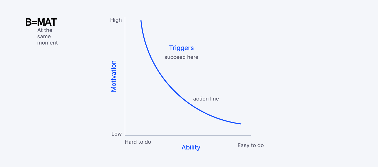
1. Fogg’s Behavior Model
To get users to do something, you need motivation, ability, and a trigger. Nothing more, nothing less.
Stanford’s B.J. Fogg broke it down simply:
- Motivation: Users need a reason to act. That could be pleasure, fear, hope, or even social approval. If they don’t care, they won’t click, swipe, or sign up.
- Ability: Make the action easy. Complexity kills engagement. If your product asks users to jump through hoops, they won’t bother.
- Trigger: Give users a nudge at the right moment. A well-timed prompt or visual cue sparks action. Without a trigger, motivation and ability aren’t enough.
Remove any one of these three elements and the behavior doesn't happen.
Real-World Example: The Share Button
Let's walk through designing a share button using Fogg's model:
- Motivation:
- Why would users share? Pride (I want to show this off), helpfulness (this will benefit my friends), identity (this reflects who I am). You can boost motivation by showing "Your friend will love this" or "Share your achievement."
- Why would users share? Pride (I want to show this off), helpfulness (this will benefit my friends), identity (this reflects who I am). You can boost motivation by showing "Your friend will love this" or "Share your achievement."
- Ability:
- Make sharing one tap. Pre-populate the message. Let users choose platforms quickly. Don't make them copy-paste or jump through hoops.
- Make sharing one tap. Pre-populate the message. Let users choose platforms quickly. Don't make them copy-paste or jump through hoops.
- Trigger:
- Put the share button exactly where users feel the impulse to share. After they complete something successfully (high motivation moment). Make it visually obvious (clear trigger).
- Put the share button exactly where users feel the impulse to share. After they complete something successfully (high motivation moment). Make it visually obvious (clear trigger).
Strava nails this. After you finish a run, motivation to share is high (you're proud). Ability is high (one tap to share to Instagram/Facebook). Trigger is obvious (big "Share" button right there). All three elements aligned.
Designing for All Three Elements
Start by Identifying the Specific Behavior
"Use our product" is too vague. "Complete signup" or "Share a post" or "Upgrade to premium" are specific behaviors you can design for.
Assess Each Element Honestly
→ Motivation: Do users want this? What's in it for them? What objections exist?
→ Ability: How hard is this to do? Where's the friction?
→ Trigger: Is there a clear prompt? Does it appear at the right time?
Fix the Weakest Element First
If ability is terrible (complex 10-step process), making the button prettier (trigger) won't help. If motivation is zero (users don't care), making it easier won't matter.
Test by Removing Elements
What happens if you remove the trigger? Does anyone still do it? That tells you how strong motivation and ability are. What if you make it harder? How much does completion drop? That reveals how much motivation exists.
When Behavior Doesn't Happen
Every action in your product—every signup, every share, every purchase—requires motivation, ability, and a trigger at the same moment. Design for all three, and users will do exactly what you hope they'll do. If users aren't doing what you want, diagnose which element is missing:
No motivation? Your value proposition is unclear, benefits aren't compelling, or users don't trust you yet. Fix your messaging, add social proof, demonstrate value before asking for action.
No ability? Too much friction, too many steps, too confusing. Simplify the process, remove fields, reduce clicks, make it obvious.
No trigger? Users want to do it and it's easy, but they forget or don't notice the opportunity. Add prompts, improve CTAs, use notifications strategically.
The beauty of this model is it gives you a diagnostic framework. When actions don't happen, one of these three elements is missing. Find it. Fix it. Watch behavior change.
2. Cognitive Load
It’s easier for users to learn something new if they can link it to a pattern they already understand.
Your role as a designer isn’t to show off how clever you are, it’s to make your users feel clever.
When your users open your app or website, they’re not looking for a mental workout. If every interaction feels like solving a puzzle, they’ll bail fast, frustrated and exhausted.
Cognitive load is all about how much mental effort a user needs to accomplish a task. The less effort, the smoother the experience, and the more likely they are to stick around.
Where UI/UX Designers Get This Wrong
You know your product inside out. Your users don't, and they never will. They're learning it for the first time, probably while distracted, possibly while frustrated about something completely unrelated. Design for that reality.
Common cognitive load killers:
- Too many choices.
- That navigation menu with fifteen options? Decision paralysis is real. More options don't mean more freedom. They mean more anxiety.
- That navigation menu with fifteen options? Decision paralysis is real. More options don't mean more freedom. They mean more anxiety.
- Unfamiliar patterns.
- When your "innovative" interface works completely differently from everything else users know, you're forcing them to build new mental models from scratch.
- When your "innovative" interface works completely differently from everything else users know, you're forcing them to build new mental models from scratch.
- Information overload.
- Forms with thirty fields visible at once. Walls of text with no visual hierarchy. Users will scan for five seconds, find nothing that makes sense, and bounce.
- Forms with thirty fields visible at once. Walls of text with no visual hierarchy. Users will scan for five seconds, find nothing that makes sense, and bounce.
- Hidden affordances.
- Buttons should look like buttons. Links should look like links. Don't make people detective their way through your interface.
- Buttons should look like buttons. Links should look like links. Don't make people detective their way through your interface.
How to Reduce Cognitive Load
Prioritize Ruthlessly
Every screen should have one primary action. Not three. Not five. One. What's the main thing users need to do here? Make that obvious and easy. Everything else is the supporting cast. If you're designing a signup page, the primary action is signing up. Not reading your terms of service, not exploring your pricing plans, not watching a demo video. Those can exist, but they shouldn't compete for attention with the signup form.
Show users what they need, when they need it. Advanced settings? Tuck them away. Rarely used features? Hide them behind a clearly labeled menu. Slack does this brilliantly. New users see a simple interface with clear actions. Power users can dive into shortcuts, integrations, and customization. Same product, different complexity levels depending on what you need.
Chunk Information Intelligently
The human brain processes information in chunks. Phone numbers are split into segments for a reason. Forms work better when grouped into logical sections. Lists become scannable when you add clear categories.
Instead of fifty settings in one endless scroll, group them: Account, Notifications, Privacy, Appearance. Now users can find what they need without reading everything.
Use Familiar Patterns
Unless you have a really good reason to reinvent the wheel, don't. Users already know how hamburger menus work, how tabs function, where the search icon lives. Building on existing mental models means users spend zero cognitive energy learning your interface.
Stripe's checkout is genius partly because it looks like every other checkout. No surprises, no learning curve. Users flow through it on autopilot.
The Litmus Test
Here's how you know if you've nailed this: watch someone use your product for the first time. Don't explain anything. Just observe. If they pause, squint at the screen, or ask "where do I...?" you've got cognitive load problems. If they move through it quickly completing tasks without confusion, you've created something that works with their brain.
Curious what’s shaping design next year? Explore the biggest UI and UX trends that will define 2026.
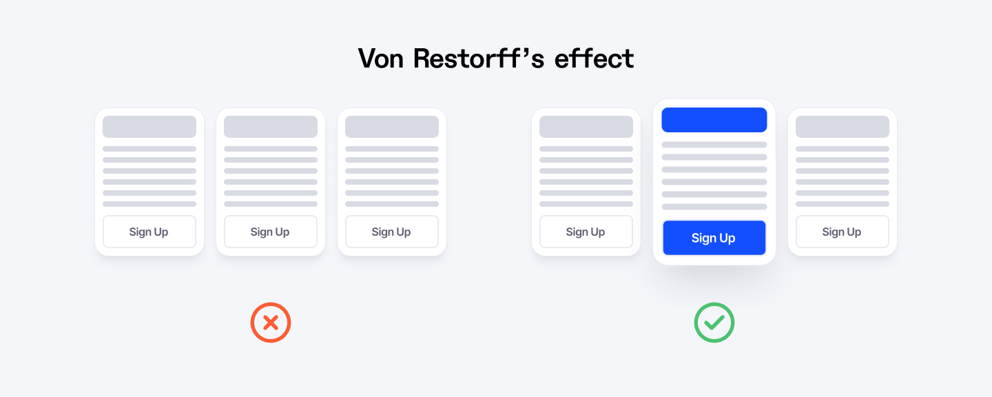
3. Von Restorff Effect
In a sea of sameness, different wins.
Humans notice what stands out. That’s the essence of the Von Restorff effect, also called the isolation effect. When several similar items are presented together, the one that’s different grabs attention and sticks in memory. In UX, this is your secret weapon for creating focal points that guide users exactly where you want them to look.
This principle doesn't work alone. It's part of a broader system of visual hierarchy. Think of it as levels of importance:
- Level 1: The one thing that's distinctly different (your hero element)
- Level 2: Important supporting elements (visible but not screaming)
- Level 3: Everything else (present but subdued)
Get these levels right and users move through your interface effortlessly, their attention guided exactly where you need it.
Where UX Designers Misuse This Principle
Designers think "make it stand out" means add more: more colors, more animations, more bold text, more badges, more everything. Then the entire interface becomes a visual circus where nothing actually stands out because everything is trying to.
I've seen dashboards where every metric is highlighted in a different color. CTAs that pulse, bounce, and glow simultaneously. Pricing pages where all three tiers scream "BEST VALUE."
When everything is special, nothing is.
The Von Restorff Effect only works when there's contrast. One thing different among many similar things. Not five things trying to be different in five different ways.
Another mistake? Making random stuff stand out. Just because you can make something distinctive doesn't mean you should. Highlighting your logo in neon green might make it memorable, but if your goal is getting users to sign up, you've wasted that cognitive spotlight on the wrong element.
How to Use the Isolation Effect
Pick One Hero Per Screen
Every screen should have one primary action or piece of information that matters most. Make that one thing visually distinct. Everything else should fade into the supporting role. Slack's empty state nails this. When you first open the app with no messages, there's one big, colorful button that says "Create a channel." Everything else is muted, minimal, gray. Your eye goes straight to that button.
Color Is the Easiest Lever
If your interface is mostly blues and grays, make your primary CTA orange or green. Instant contrast. Instant attention. This is why "Buy now" buttons are often bright colors that don't appear anywhere else on the page. Spotify's green is iconic partly because they use it sparingly. Most of their interface is black, white, and gray. The green play button? Your eye finds it instantly.
Size and Spacing Create Isolation Too
You don't always need color. A button that's noticeably larger than surrounding elements will get attention. A headline with generous white space around it stands out from dense text blocks. Duolingo uses this smartly. Most of the app is static, but when you complete a lesson, there's a brief celebratory animation.
Typography Can Create Contrast
Surrounded by body text in the same font and size? Make one element bold, or bigger, or a different weight. Headlines work because they break the pattern of paragraph text. Apple's product pages do this masterfully. Mostly clean, minimal text in one typeface. Then boom, one huge product name or feature callout that's impossible to miss.
When to Break Sameness (and When Not To)
Use isolation for:
- Primary calls to action
- Key information or warnings
- The option you're recommending
- Navigation to important features
- Error messages or critical alerts
Don't use isolation for:
- Multiple things competing for attention
- Decorative elements that don't drive action
- Everything, because then nothing stands out
- Branding elements users don't need to interact with
The Acid Test
If someone showed you your screen for three seconds, what would they remember? That's what's actually standing out. If the answer is "I don't know, lots of things?" you've diluted the effect.
4. Hick’s Law
The paradox: give people more choices and they'll make fewer decisions.
Ever stared at a dropdown with 300 items and thought, there has to be an easier way? That’s Hick’s Law at work. The more choices you give someone, the longer it takes them to decide, and sometimes, they just give up.
As a UX designer, your job is to guide users toward action without overwhelming them. Good design doesn’t take away choice: it frames it, prioritizes it, and makes it feel effortless.
Where This Shows Up in UI/UX Design
Hick's Law infiltrates every corner of design where choices exist.
- Onboarding flows that ask twenty questions upfront.
- Each question adds friction. Users came here to accomplish something, not take a survey. Every additional field is another chance for them to reconsider whether they need your product.
- Each question adds friction. Users came here to accomplish something, not take a survey. Every additional field is another chance for them to reconsider whether they need your product.
- Pricing pages with eight tiers.
- Basic, Plus, Premium, Professional, Business, Enterprise, Ultimate, and God Mode. By the time users figure out which one they need, they've lost interest. Three options is the sweet spot. Four is pushing it. Eight is designer ego.
- Basic, Plus, Premium, Professional, Business, Enterprise, Ultimate, and God Mode. By the time users figure out which one they need, they've lost interest. Three options is the sweet spot. Four is pushing it. Eight is designer ego.
- CTAs that compete for attention.
- "Sign up," "Learn more," "Watch demo," "Start free trial," "Talk to sales," "Download whitepaper." Which one should users click? They don't know either, so they click nothing.
- "Sign up," "Learn more," "Watch demo," "Start free trial," "Talk to sales," "Download whitepaper." Which one should users click? They don't know either, so they click nothing.
The Instagram DM Problem
Here's a real example. Instagram's DM screen used to have a ton of options at the top: camera, video, stickers, GIFs, voice messages, photos from library, polls, locations. Every action required choosing from this buffet of possibilities.
Then they simplified. Now there's essentially one input field and one send button. Want to add something? The camera icon is right there. Everything else appears contextually when relevant. Decision time dropped to nearly zero. Sending a message became automatic.
How to Apply Hick's Law
Start with the 80/20 Rule
Eighty percent of users will use twenty percent of your features. Design for that twenty percent upfront. Make those options prominent, obvious, fast. Google's homepage is the ultimate example. One search box. That's it. All the power of the world's most sophisticated search engine accessible through one field and one button. Advanced search exists, but ninety-nine percent of users never need it.
Progressive Disclosure
Don't show advanced options until users need them. New user signing up? Ask for email and password. That's it. Payment method, profile details, preferences? Those can wait until the user has seen value from your product. Spotify doesn't bombard new users with every possible setting and playlist option. You pick a few artists you like and you're listening to music. Customization comes later, after you're hooked.
Smart Defaults Do the Heavy Lifting
Most users won't change default settings. So make your defaults actually good. Pre-select the most common option. Pre-fill what you can. Let users override if they want, but don't make them configure everything just to get started. Amazon's "Buy now" button remembers your default shipping address and payment method. One click and you're done.
Highlight the Recommended Option
When choices are unavoidable, guide users toward the best one. Add a "Most popular" badge. Use visual hierarchy to make one option more prominent. Pricing pages that mark one plan as "Recommended" or "Best value" convert way better than ones that present all options equally. Users want someone to tell them what most people choose. It reduces the mental work of comparison.
The Real Test
Here's how you know if you're ignoring Hick's Law: track time to completion. If users are spending minutes on a screen that should take seconds, you've given them too much to process. Better yet, watch session recordings. See where users pause, hover indecisively, or bounce.
Cut the clutter. Clear the path. Watch decisions happen faster.
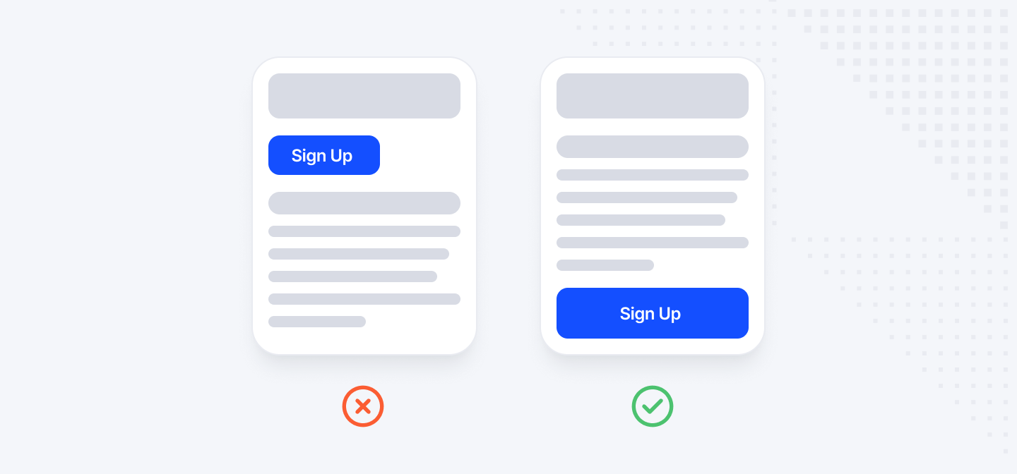
5. Fitts’ Law
The smaller and farther away something is, the harder it is to click, and users hate it.
You know what's infuriating? Trying to tap that microscopic ☒ to close a popup on your phone. You miss. You tap again. You accidentally click the ad instead. That's not user error. That's a UX/UI designer ignoring Fitts' Law, one of the most fundamental principles in interface design. Originally developed for pilots and aircraft controls, the principle applies perfectly to screens, mice, and thumbs.
Fitts' Law states: the time required to move to a target is determined by the target's size and distance. Simply put: bigger, closer, and well-placed elements make life easier for your users.
Where This Goes Wrong
Walk through any website or app and you'll find Fitts' Law violations everywhere. Tiny clickable areas that require surgeon-level precision. Important actions buried in corners. Dangerous buttons right next to safe ones.
- Mobile interfaces with 20px tap targets.
- Your finger is roughly 45px wide. That 20px button is frustrating. Users will tap, miss, tap again, miss again, and eventually give up. Apple's Human Interface Guidelines recommend 44px minimum for touch targets. Fingers are a certain size. Design accordingly.
- Your finger is roughly 45px wide. That 20px button is frustrating. Users will tap, miss, tap again, miss again, and eventually give up. Apple's Human Interface Guidelines recommend 44px minimum for touch targets. Fingers are a certain size. Design accordingly.
- Close buttons designed for ants.
- Ever notice how hard it is to close some mobile ads? That's not an accident. They make the X tiny and position it where you'll accidentally tap the ad instead. Don't be that designer.
- Ever notice how hard it is to close some mobile ads? That's not an accident. They make the X tiny and position it where you'll accidentally tap the ad instead. Don't be that designer.
- Destructive actions next to harmless ones.
- "Save" button right next to "Delete Forever" button, both the same size and style. Users clicking quickly will eventually hit the wrong one. Slack learned this lesson. Their "Delete message" option used to be right in the main menu. Too easy to click by mistake. Now it's nested, requires confirmation, and is visually distinct.
- "Save" button right next to "Delete Forever" button, both the same size and style. Users clicking quickly will eventually hit the wrong one. Slack learned this lesson. Their "Delete message" option used to be right in the main menu. Too easy to click by mistake. Now it's nested, requires confirmation, and is visually distinct.
- Navigation buried in impossible-to-reach zones.
- On mobile, users hold their phone one-handed and use their thumb for most interactions. That means the bottom half of the screen is easy to reach. The top? Requires hand gymnastics. Yet designers constantly put primary navigation at the very top.
- On mobile, users hold their phone one-handed and use their thumb for most interactions. That means the bottom half of the screen is easy to reach. The top? Requires hand gymnastics. Yet designers constantly put primary navigation at the very top.
Practical Tips to Implement Fitts’ Law
Size Your Touch Targets Properly
44px minimum on mobile. For important actions, go bigger. On a desktop, clickable areas should be at least 24px, ideally 32px or larger. Yes, your mouse cursor is precise. But humans aren't. We overshoot, we undershoot, we click slightly off-center. Bigger targets forgive these micro-mistakes.
Increase the Clickable Area Beyond the Visual Element
That text link doesn't need to be tiny just because the text is small. Add padding. Make the entire container clickable, not just the letters. GitHub does this well. Their buttons have generous padding. You're not trying to click the exact text, you're clicking a big comfortable zone around it. Feels effortless.
Use the Thumb Zone on Mobile
Draw an arc from the bottom corner of the phone screen. That's the comfortable reach zone for a thumb. Primary actions should live there. Secondary actions can go higher. Stuff users rarely need? Top of the screen is fine. Tinder gets this. Swipe controls are in the bottom third. Profile actions at the top. You can use the entire app one-handed without stretching.
Make Frequently Used Actions Bigger
Your primary CTA should be the biggest, most accessible button. Secondary actions can be smaller. Tertiary actions smaller still. Spotify's play button is huge. Skip, heart, and queue buttons are medium. The options menu is small. The visual hierarchy matches usage frequency.
Testing Your Fitts' Law Compliance
Want to know if your interface respects Fitts' Law? Watch real users interact with it. Track these metrics:
- Misclick rate: How often do users click the wrong thing? If it's above 5%, your targets are probably too small or too close together.
- Time to target: How long does it take users to move their cursor or finger to an action? Faster is better. If users are hovering around before clicking, they're aiming, which means the target feels risky.
- Accidental clicks on destructive actions: How often do users accidentally delete, cancel, or close things? Every accidental click is a design failure.
Check out the core front-end design principles every developer should master to build cleaner, smarter interfaces.
6. The Peak-End Rule
People don’t remember the whole experience, they remember the peak and the ending.
Your users aren’t logging every click, scroll, or screen. They’re remembering the high points and the final moments. Nail those, and your product sticks in their minds. Mess them up, and all your hard work fades into forgettable noise.
The Peak-End Rule reminds us that experiences are remembered emotionally, not rationally. Users recall moments that spark delight or frustration, and the way you finish shapes their lasting impression.
Where UX Designers Misuse This Principle
Most products treat endings like an afterthought. Onboarding is polished, core features are refined, but the moment after a user completes an action? Generic success message. Plain confirmation screen. Zero emotional payoff.
- Boring confirmation pages.
- The user just spent ten minutes filling out a complex form. They hit submit and get... "Thank you. Your request has been received." In default system font. On a white screen. With a tiny "OK" button. That's your ending. That's what they'll remember.
- The user just spent ten minutes filling out a complex form. They hit submit and get... "Thank you. Your request has been received." In default system font. On a white screen. With a tiny "OK" button. That's your ending. That's what they'll remember.
- Neglected success states.
- The user completes a signup, makes a purchase, finishes a tutorial. These are major moments. These should feel like victories. Instead, they often feel like dead ends. "Success" in a green box. Next screen loads. Moving on. Mailchimp used to just show "Campaign sent" after you sent an email. Functional, sure, but forgettable. Now? High five animation. "Way to go, friend!" It's playful and it's memorable.
- The user completes a signup, makes a purchase, finishes a tutorial. These are major moments. These should feel like victories. Instead, they often feel like dead ends. "Success" in a green box. Next screen loads. Moving on. Mailchimp used to just show "Campaign sent" after you sent an email. Functional, sure, but forgettable. Now? High five animation. "Way to go, friend!" It's playful and it's memorable.
- Missing the peak entirely.
- Some products never create a peak moment at all. Everything is uniformly decent. Nothing stands out. Nothing delights. Users complete tasks and feel... nothing. The peak doesn't have to be flashy. It just needs to be meaningful. The moment Spotify Wrapped shows you your top artist? Peak. The moment your Uber arrives and you get that "Your ride is here" notification? Peak.
- Some products never create a peak moment at all. Everything is uniformly decent. Nothing stands out. Nothing delights. Users complete tasks and feel... nothing. The peak doesn't have to be flashy. It just needs to be meaningful. The moment Spotify Wrapped shows you your top artist? Peak. The moment your Uber arrives and you get that "Your ride is here" notification? Peak.
How to Create Peaks That Matter
Identify Your Product's Natural High Points
Where do users accomplish something meaningful? First successful login. First completed task. Milestone achievements. Problem solved. Goal reached. These moments deserve special treatment. Strava nails this. Post a run and the app doesn't just save your data. It shows you your route on a map, highlights your personal records, awards badges, gives you kudos from friends.
Add Friction to Make the Release More Satisfying
This sounds counterintuitive, but slight resistance makes the payoff sweeter. Ever notice how slot machines make you pull the lever before the reward? Or how satisfying it is to pop bubble wrap? Tiny resistance, then release.
Surprise and Delight at Unexpected Moments
Peaks don't have to be at obvious achievement points. Random moments of delight create peaks too. Playful error messages, unexpected animations when users hover over something.
Personalization Amplifies Peaks
Generic celebrations feel hollow. Personalized ones feel genuine. Use the user's name, reference their specific achievement, acknowledge their progress. Headspace does this beautifully. Complete a meditation streak and the app doesn't just say "Good job." It shows you how many days you've meditated, how much time you've invested, and how that compares to your goals.
How to Create Endings That Stick
Every Interaction Needs a Proper Ending
Doesn't matter if it's a major workflow or a minor task. Users completed something. Acknowledge it. Make them feel good about it. When you favorite a tweet, that little heart animation and color change? That's the ending. It feels satisfying.
Confirmation Isn't Enough
Celebration is better. "Your order has been placed" is confirmation. "Your order is confirmed! You'll receive it by Thursday. We'll send you tracking info soon." That's better. It resolves anxiety, sets expectations, and closes the loop properly.
Thank You Pages Are Prime Real Estate
Edit text: Users just converted, signed up, or purchased. They're in a positive state. This is the perfect moment to reinforce that decision, suggest next steps, or build connection.
Exit Experiences Matter Too
How users leave your product shapes their memory. Logging out, closing an app, canceling a subscription. These are endings. Make them graceful. Spotify's "Are you sure you want to log out?" isn't just a confirmation. It reminds you what you'll lose access to.
Measuring Peak and End Moments
How do you know if you're creating memorable peaks and endings? Ask users:
- "What was the best moment of using our product?"
- "How did you feel when you completed [action]?"
- "What do you remember most about your experience?"
If they struggle to answer or give generic responses, you haven't created peaks. If they light up talking about a specific moment and how things wrapped up, you've nailed it.
Watch session recordings and look for emotional moments.
- Where do users pause?
- Where do they seem satisfied or frustrated?
Those pauses are potential peaks, moments intense enough to create a memory.
7. Familiarity Over Originality
Users don’t want a triangular wheel, no matter how ‘innovative’ it looks.
We all love to be creative, but when it comes to UX, familiarity wins. People feel safe when they recognize patterns, they know what to expect, and that builds trust. They make your product predictable in a way that feels comfortable and reliable. Mess with login forms, navigation, or checkout flows too much, and users will leave.
Originality should enhance the experience, not complicate it. Stick to convention on core interactions, and save your creativity for the visuals, animations, and tiny delightful surprises.
Where UX Designers Get This Wrong
The temptation to be different is strongest exactly where you should resist it most: core functionality. Login flows, navigation, forms, checkouts. The basic building blocks that every digital product needs.
- Creative login screens.
- I've seen logins where the password field only appears after you enter your email. Or where the submit button changes position. Or where "username" and "password" are replaced with cryptic icons. Every single one creates friction.
- I've seen logins where the password field only appears after you enter your email. Or where the submit button changes position. Or where "username" and "password" are replaced with cryptic icons. Every single one creates friction.
- Innovative navigation.
- Hidden menus that require three clicks to access. Navigation that works completely differently on each page. Menus that slide in from unexpected directions. Apple's first version of iOS 7 Music app tried something different with navigation. Gestures were unclear, sections weren't obviously tappable, the UI felt alien even to iPhone users. They walked it back in later versions toward more conventional patterns.
- Hidden menus that require three clicks to access. Navigation that works completely differently on each page. Menus that slide in from unexpected directions. Apple's first version of iOS 7 Music app tried something different with navigation. Gestures were unclear, sections weren't obviously tappable, the UI felt alien even to iPhone users. They walked it back in later versions toward more conventional patterns.
- Reinvented form interactions.
- Placeholder text that disappears when you click (so users forget what the field was for). Submit buttons that move. Multi-step forms that don't show progress. Field validation that works differently than users expect.
- Placeholder text that disappears when you click (so users forget what the field was for). Submit buttons that move. Multi-step forms that don't show progress. Field validation that works differently than users expect.
- Novel checkout flows.
- E-commerce sites that get creative with their checkout process usually see their conversion rates tank. Users have done online checkouts hundreds of times. They know the moves: cart, shipping info, payment, confirmation. Mess with that sequence and drop-off rates spike.
- E-commerce sites that get creative with their checkout process usually see their conversion rates tank. Users have done online checkouts hundreds of times. They know the moves: cart, shipping info, payment, confirmation. Mess with that sequence and drop-off rates spike.
The Patterns You Should Never Break
Some conventions are so universal that breaking them is almost always a mistake:
- Logo in the top left that links to the homepage.
- This is sacred. Users click that logo expecting to get home. Put it anywhere else or make it not clickable, and you've violated a trust so fundamental people get genuinely angry.
- This is sacred. Users click that logo expecting to get home. Put it anywhere else or make it not clickable, and you've violated a trust so fundamental people get genuinely angry.
- Search icon that looks like a magnifying glass.
- You can style it however you want, but the icon should be recognizable. Get too abstract and users won't know it's search.
- You can style it however you want, but the icon should be recognizable. Get too abstract and users won't know it's search.
- Forms that flow top to bottom, left to right.
- Email then password, not password then email. Name before address. Credit card before billing info. There's a standard order. Use it.
- Email then password, not password then email. Name before address. Credit card before billing info. There's a standard order. Use it.
- Blue underlined text is a link.
- Or at least clearly differentiated from regular text. Making links look identical to non-clickable text destroys scannability.
- Or at least clearly differentiated from regular text. Making links look identical to non-clickable text destroys scannability.
- Shopping cart in the upper right.
- E-commerce users look there automatically. Move it somewhere creative and they'll think you don't have a cart.
- E-commerce users look there automatically. Move it somewhere creative and they'll think you don't have a cart.
- Close buttons in the top right of modals.
- ☒ marks the spot. Upper right corner. Every time. Put it anywhere else and users will hunt for it.
- ☒ marks the spot. Upper right corner. Every time. Put it anywhere else and users will hunt for it.
- Hamburger menu icon for hidden navigation.
- Three horizontal lines. Everyone knows what this means now. Use something different and you're just being difficult.
- Three horizontal lines. Everyone knows what this means now. Use something different and you're just being difficult.
The Litmus Test for Familiarity
Before you innovate on a standard pattern, ask yourself:
Will users understand this immediately? If they need to think about it, you've created cognitive load.
Am I solving a real user problem or scratching a design itch? Be honest. Sometimes we just want to make something interesting because we're bored with conventions.
What percentage of users will this confuse versus delight? If the ratio isn't overwhelmingly in favor of delight, stick with familiar.
Would I want to use this if I was tired, distracted, or in a hurry? Because that's how most people use most software.
Read how talented UI/UX designers joined Fishbrain through Index.dev and helped build one of the most-loved fishing apps.
Wrapping It Up: Design with the Human Mind in Mind
The bar for user experience keeps rising. Users have been trained by the best products in the world. They've used Google, they've bought from Amazon, they've scrolled through TikTok. Their expectations are shaped by products with billion-dollar design teams and decades of optimization.
You're competing with that. Not directly, maybe, but in users' minds, their experience with your product is compared to every other digital experience they've had. If your app feels harder to use than Instagram, they'll notice. If your checkout process is clunkier than Amazon's, they'll abandon it.
You don't need a billion-dollar budget to apply psychological principles. You just need to understand people. Understanding human psychology is more valuable than mastering any design tool. Figma skills become outdated. Design trends come and go. But the way human brains work? That's been consistent for thousands of years and it'll be consistent for thousands more.
Great design isn't about making things look clever. It's about making people feel clever.
So as you tackle your next design challenge, keep these principles close. Reduce friction, guide attention, create delight, and respect familiarity.
➡︎ Master psychology-driven design principles? Join Index.dev's network of elite remote designers and developers. Work with companies that value user-centered thinking and evidence-based design.
➡︎ Want to build products that feel intuitive and convert better? Hire UX/UI designers who understand human behaviour. Index.dev connects you with senior designers who create intuitive, conversion-focused experiences. Our vetted talent pool includes experts in behavioral design, user research, and interface optimization.
➡︎ Want to explore more insights on AI tools and modern frontend design? Check out our deep-dive reviews on using Google Stitch AI to generate UI in minutes, see how Kombai performs as a frontend-focused AI agent, discover the best AI models shaping UI and frontend development today, learn the latest front-end trends and frameworks, and rethink your product layouts with practical SaaS design principles and examples.
