Roughly 175 new websites are created every minute, and 252,000 launch every single day. That’s hundreds of thousands of sites flooding the web, all competing for the same eyeballs. And 94% of first impressions are based purely on design.
With that much noise, how do you make your site impossible to ignore?
You’ve seen the usual trend roundups by now. Another article telling you gradients are “back,” or neumorphism is the future (no, it’s not). Another listicle hyping “ZeroUI” without ever showing what that means for your work.
I’ve done the digging, talked to designers on the front lines, and poured through the data. This isn’t about fads. This is about where web design is headed in 2026, what it means for your users, and how it can shape the way you build and experience your work. Not everything will fit every brand or project, but the ideas here will inspire, challenge, and push you to think bigger.
Let’s dive in.
Join Index.dev’s talent network and collaborate on AI-driven, 3D-rich, and high-performance websites globally.
Looking Back at 2025
Let’s rewind for a second.
2025 was the year designers collectively said, “Why not?”
It was experimental. Messy in a good way. Designers weren’t afraid to break things and rebuild them differently. We pushed our tools, our workflows, and sometimes even our users, just to see what might stick.
- AI experimentation went wild.
- Not just for speeding up tasks, but as a real creative partner. According to Adobe’s 2025 Creative Trends Report, over 60% of designers used AI tools for ideation, from generating mood boards to sketching early layout concepts. The challenge was how to keep the “human touch” alive in the process.
- Not just for speeding up tasks, but as a real creative partner. According to Adobe’s 2025 Creative Trends Report, over 60% of designers used AI tools for ideation, from generating mood boards to sketching early layout concepts. The challenge was how to keep the “human touch” alive in the process.
- Typography got louder and bolder.
- Brutalism returned, but with polish, a sort of functional rebellion. Designers used type not just to communicate, but to demand attention.
- Brutalism returned, but with polish, a sort of functional rebellion. Designers used type not just to communicate, but to demand attention.
- Minimalism evolved.
- After years of visual overload, many teams found balance in simplicity. The trend was strategic. Fast load times, cleaner UX, and fewer cognitive barriers.
- After years of visual overload, many teams found balance in simplicity. The trend was strategic. Fast load times, cleaner UX, and fewer cognitive barriers.
- Then came 3D and motion.
- The explosion of WebGL and lighter frameworks made 3D more accessible. What once was a gimmick became an experience.
- The explosion of WebGL and lighter frameworks made 3D more accessible. What once was a gimmick became an experience.
- Accessibility finally started moving from talk to action.
- Websites using accessibility guidelines saw an average traffic increase of 18% year-over-year. Designers started talking about it more. Implementation was still inconsistent.
- Websites using accessibility guidelines saw an average traffic increase of 18% year-over-year. Designers started talking about it more. Implementation was still inconsistent.
It was a year of permission. Permission to be bold. Permission to break things. Permission to experiment without knowing if it would work.
How Design Priorities Are Evolving
2026 isn't about abandoning everything we learned in 2025. It's about growing up.
We’re not designing for “wow” anymore; we’re designing for WHY.
- AI, for example, isn’t a novelty anymore.
- It’s quietly becoming part of the creative muscle. Designers are using it to analyze user behavior, predict design outcomes, and automate repetitive testing.
- It’s quietly becoming part of the creative muscle. Designers are using it to analyze user behavior, predict design outcomes, and automate repetitive testing.
- Bold typography and brutalist touches are still around.
- We’re seeing them used to clarify rather than shock, guiding the eye, improving scannability, and creating intentional rhythm on the page.
- We’re seeing them used to clarify rather than shock, guiding the eye, improving scannability, and creating intentional rhythm on the page.
- 3D and motion are evolving too.
- The tech’s getting lighter, faster, and more purposeful. We’re not designing for “wow” anymore; we’re designing for WHY. Motion supports storytelling. Depth improves comprehension. It’s experience-first now.
- The tech’s getting lighter, faster, and more purposeful. We’re not designing for “wow” anymore; we’re designing for WHY. Motion supports storytelling. Depth improves comprehension. It’s experience-first now.
2026 is more about intentionality. Taking what was experimental and making it essential. Taking what was flashy and making it functional. Digital agency Bizango suggests adapting this shift by focusing on purposeful design that supports both usability and storytelling.
The trends that started as “cool new ideas” are now being integrated into thoughtful, scalable design systems.
Next up: The 12 biggest UI/UX design trends to watch in 2026.
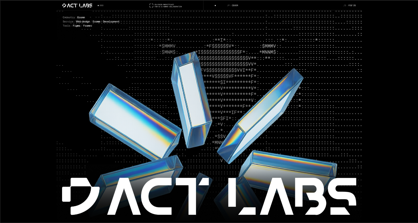
1. AI-First Design
In 2025, Adobe reported that 86% of global creators use creative Generative AI.
AI isn’t a sidekick anymore. It’s in the room with you: shaping, iterating, and co-creating. AI now sits inside the design process itself.It helps sketch wireframes, generate layouts, test color systems, even fine-tune motion.
And it’s no longer about automation, it’s about collaboration. You don’t hand off work to AI and wait for results. You talk to it, explore ideas with it, build off what it gives you.
Source: AI Agent Web3 Website UI/UX & Brand Identity Design | Behance
What AI Looks Like Right Now
AI has already slipped quietly into your favorite tools. You’ve probably seen it: Webflow’s AI-driven component builder, Figma’s “make this responsive” magic, Notion’s content suggestions, or Framer’s instant page generator. These are part of the workflow.
Designers use AI to:
- Create first-draft wireframes and UI layouts in seconds
- Generate half-ready UI copy (headlines, buttons, tooltips)
- Auto-adjust designs for different devices
- Instantly swap visual styles or tone directions
- Speed-test accessibility and color contrast
You give it a prompt. It gives you a prototype. Then you refine and direct, like an art director guiding a very fast intern.
What AI Will Look Like in 2026
AI is about to move from helping you design faster to helping you design smarter.
Here’s where it’s heading:
- AI will pre-build structure.
- You’ll start from wireframes that already make UX sense, not empty artboards.
- You’ll start from wireframes that already make UX sense, not empty artboards.
- UI copy will come half-written.
- Button labels, headlines, microcopy... it'll show up pre-drafted, ready for a quick polish.
- Button labels, headlines, microcopy... it'll show up pre-drafted, ready for a quick polish.
- Prompts will become a core design skill.
- Describing what you want from AI will matter as much as moving pixels on a screen.
- Describing what you want from AI will matter as much as moving pixels on a screen.
- Design systems will self-adapt.
- One layout can instantly reflow across platforms with perfect alignment and hierarchy.
- One layout can instantly reflow across platforms with perfect alignment and hierarchy.
- Personalization will scale.
- AI will tailor visuals, typography, and content to each visitor, all within your existing grid.
- AI will tailor visuals, typography, and content to each visitor, all within your existing grid.
- Design reviews will be co-piloted.
- You’ll get automated design critiques with suggestions before clients even open Figma.
- You’ll get automated design critiques with suggestions before clients even open Figma.
Quick Tip
Don’t just learn prompts. Build your own “AI design rituals.”
Start every project with a creative jam session between you and your AI tool. Ask it for 5 layout directions, 3 tone moods, and 2 unexpected twists. You’ll be shocked how often the weirdest one sparks your best work.
2. Responsive 3D
3D on the web isn’t decoration anymore. With tools like Spline and React Three Fiber, designers can build 3D environments that move, tilt, and respond to users in real-time. The key isn’t just motion. It’s emotion. Responsive 3D can guide attention, tell stories, and create trust, all while making a page feel alive.
How Designers Use It Today
In 2025, 3D was often flashy: big hero images, oversized typography, and motion meant to grab attention. But Nielsen Norman Group research shows that interactive visuals can increase user engagement by 25%, which means there’s more than just “wow” at play. New tools are making it easier to convert static 2D to 3D assets, closing the gap between concept and execution.
Designers now use 3D to:
- Highlight product features interactively
- Explain complex concepts through visual storytelling
- Create immersive brand experiences
- Add subtle depth and cues that guide users’ eyes
What 3D Will Do in 2026
By 2026, 3D won’t be a gimmick. It will feel natural, purposeful, and fully interactive.
Expect to see:
- Fully responsive 3D environments.
- Design once, and your 3D elements scale and adjust across desktop, tablet, and mobile without breaking layout or usability.
- Design once, and your 3D elements scale and adjust across desktop, tablet, and mobile without breaking layout or usability.
- Interactive storytelling.
- Objects will react to hover, scroll, and gestures, guiding users through your content instead of just sitting there looking pretty.
- Objects will react to hover, scroll, and gestures, guiding users through your content instead of just sitting there looking pretty.
- Micro-interactions for function.
- Buttons, menus, or cards will subtly move, tilt, or morph to confirm actions, hint at next steps, or reinforce hierarchy.
- Buttons, menus, or cards will subtly move, tilt, or morph to confirm actions, hint at next steps, or reinforce hierarchy.
- Contextual visuals.
- 3D will show how products work, explain interfaces, or create immersive brand environments, making experiences intuitive and memorable.
- 3D will show how products work, explain interfaces, or create immersive brand environments, making experiences intuitive and memorable.
- Performance-focused models.
- 3D will load instantly with lightweight files and progressive rendering so users don’t wait, especially on mobile.
- 3D will load instantly with lightweight files and progressive rendering so users don’t wait, especially on mobile.
3D makes your designs felt, not just seen. It turns scrolling into an experience, helps users understand your product intuitively, and builds trust through interaction.
Quick Tip
Start small: add a single interactive 3D element that tells a story or explains a function. Even a simple rotating product or a responsive background can make your site feel alive, without overwhelming performance.
3. Ambient UI
You’ve designed every type of button, menu, and slider imaginable. So what’s next? The interface itself is starting to disappear. Instead of relying on screens and visible controls, interaction happens naturally, through voice, gesture, motion, and sensors. You don’t click. You move, you speak, you exist in the interface.
Smart home devices, AR apps, and wearable tech are already experimenting with this. In fact, the report predicts that by 2026, the majority of all digital interactions will happen without a traditional screen. That’s a huge opportunity for designers to rethink how humans engage with digital products.
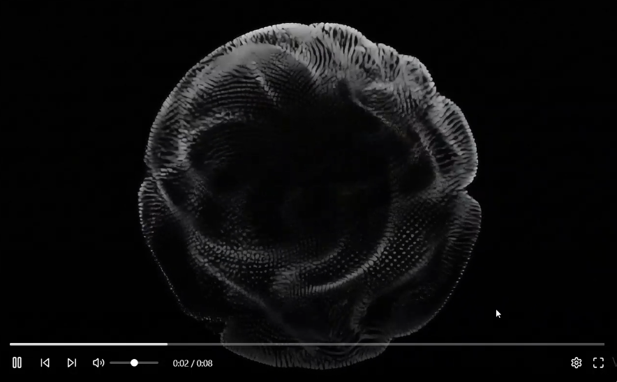
Source: Video Player UI Design | Dribble
How Designers Are Using It Today
Right now, Ambient UI is still niche, mostly in experimental projects and AR/VR experiences.
Designers are:
- Adding voice commands to apps and websites
- Using motion detection for interactive installations
- Testing micro-interactions triggered by gestures or facial expressions
- Leveraging sensor data to customize experiences in real-time
Users don’t want to think about clicking or scrolling anymore. They want systems that respond to them naturally. Ambient UI frees your design from pixels, giving people interactions that feel effortless, emotional, and human. It’s the next step in making digital products feel alive.
What It Will Look Like in 2026
Ambient UI will shift from novelty to expectation.
- Voice and gesture will lead.
- Users will interact by talking, moving, or scanning, not just clicking. Commands will feel conversational and intuitive.
- Users will interact by talking, moving, or scanning, not just clicking. Commands will feel conversational and intuitive.
- Context-aware interactions.
- Devices will detect location, light, or motion and adjust the UI automatically, creating seamless, adaptive experiences.
- Devices will detect location, light, or motion and adjust the UI automatically, creating seamless, adaptive experiences.
- Minimalist feedback.
- Subtle audio, haptic, or visual cues will confirm actions without breaking immersion.
- Subtle audio, haptic, or visual cues will confirm actions without breaking immersion.
- Invisible personalization.
- Interfaces will anticipate needs based on behavior, adjusting content and layout silently and smartly.
- Interfaces will anticipate needs based on behavior, adjusting content and layout silently and smartly.
- Multi-device continuity.
- Ambient UIs will flow across phones, smart speakers, AR glasses, and desktops without friction.
- Ambient UIs will flow across phones, smart speakers, AR glasses, and desktops without friction.
This is about designing experience-first, not screen-first. The interface becomes intuitive because it reacts to people, not the other way around.
Quick Tip
Start experimenting with Ambient UI by adding context-sensitive micro-interactions. For example, let a page respond to scroll speed, cursor movement, or voice input in subtle ways. You don’t need a full Zero UI experience yet, even small gestures can make users feel the interface understands them.
4. Performance as Design
If 2025 was about adding flair, 2026 is about stripping away anything that slows users down. Mobile-first is about delivering experiences that feel instant. Every millisecond counts: research shows that a 100ms delay in load time can reduce conversion by 7%. Users notice speed even if they don’t consciously think about it.
Designing for performance means thinking of speed as a feature. Your animations, images, and interactions should strengthen the experience.
How Designers Are Using It Today
Performance-driven design is already shaping web experiences:
- Burst-mode scroll feeds:
- TikTok and Instagram Reels deliver content in rapid-fire snippets, keeping users glued without waiting.
- TikTok and Instagram Reels deliver content in rapid-fire snippets, keeping users glued without waiting.
- Functional motion:
- Animations now guide attention, confirm actions, and clarify flows, like a subtle button pulse or a swipe transition.
- Animations now guide attention, confirm actions, and clarify flows, like a subtle button pulse or a swipe transition.
- Scroll storytelling:
- Each scroll unfolds a narrative with visuals, motion, and micro-interactions, think Apple product pages.
- Each scroll unfolds a narrative with visuals, motion, and micro-interactions, think Apple product pages.
Performance as design is no longer just about speed and visuals. It is also about understanding the business impact of every design decision. Tools like a DAM ROI calculator help teams quantify how design systems, asset workflows, and performance improvements translate into real operational value.
What It Will Look Like in 2026
Speed as a design principle will go further:
- Instant content delivery.
- Pages will load and interact instantly, even with rich visuals or animations, keeping users engaged from the first scroll.
- Pages will load and interact instantly, even with rich visuals or animations, keeping users engaged from the first scroll.
- Burst-mode scroll.
- Content will appear in quick, snackable bursts — think TikTok-style feeds — keeping attention high without overwhelming.
- Content will appear in quick, snackable bursts — think TikTok-style feeds — keeping attention high without overwhelming.
- Functional motion.
- Animations will clarify interactions, confirm actions, or guide the eye instead of serving pure decoration.
- Animations will clarify interactions, confirm actions, or guide the eye instead of serving pure decoration.
- Scroll-driven storytelling.
- Long-form pages will unfold like a narrative, with visuals, text, and motion working together to tell a story fluidly.
- Long-form pages will unfold like a narrative, with visuals, text, and motion working together to tell a story fluidly.
- Performance-first design systems.
- Designers will integrate speed considerations from day one: optimized images, lazy-loading, minimal scripts, and smooth transitions.
- Designers will integrate speed considerations from day one: optimized images, lazy-loading, minimal scripts, and smooth transitions.
Quick Tip
Think of performance as a design tool. Use progressive loading and micro-interactions to keep users engaged while heavy content loads. Even a subtle placeholder animation can make a page feel instant and alive.
5. Neo-Brutalism
Polished, cookie-cutter templates are fading. Designers are embracing something more human: simple layouts, bold typography, and unpolished elements that feel real. This is Neo-Brutalism: clean but raw, minimal yet striking, and unapologetically authentic.
It’s not about being messy for the sake of it. It’s about stripping away distractions so every word, color, and element hits harder. Simple grids, restrained color palettes, and fewer images make the content breathe and resonate.
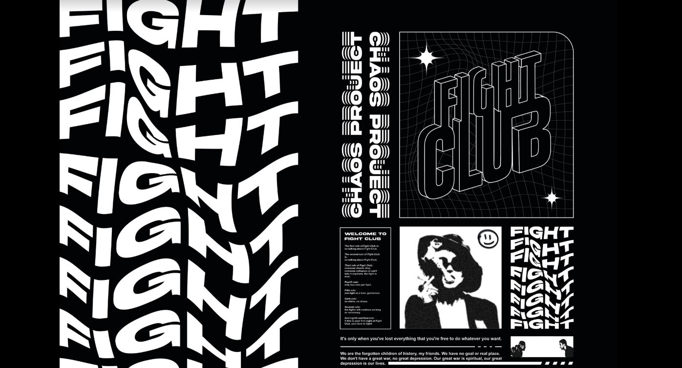
Source: Fight Club Poster | Behance
How Designers Are Using It Today
Neo-Brutalism has found its home mostly in portfolios, personal sites, and tech brands.
Designers are:
- Using bold, oversized typography to grab attention
- Leaning into simple grids that highlight content, not decoration
- Applying raw, unpolished UI elements that feel human, not templated
- Minimizing images and fancy graphics to keep focus on the story
Research shows 38% of users will stop engaging with a website if the layout is unattractive, making Neo-Brutalism’s raw authenticity a real competitive edge in capturing attention.
What It Will Look Like in 2026
Neo-Brutalism will evolve from a niche style to a strategic choice:
- Clean but bold layouts.
- Simple grids, minimal imagery, and restrained color make each element hit harder and communicate more clearly.
- Simple grids, minimal imagery, and restrained color make each element hit harder and communicate more clearly.
- Typography as hierarchy.
- Bold, in-your-face type will guide attention and communicate character without distractions.
- Bold, in-your-face type will guide attention and communicate character without distractions.
- Intentional rawness.
- Rough edges, uneven spacing, or playful misalignments will make sites feel human and approachable.
- Rough edges, uneven spacing, or playful misalignments will make sites feel human and approachable.
- Functional minimalism.
- Every visual choice has purpose: clarity, speed, and brand personality, not decoration.
- Every visual choice has purpose: clarity, speed, and brand personality, not decoration.
- Experimental components.
- Hover effects, interactive cards, and micro-transitions will complement the stark aesthetic without losing usability.
- Hover effects, interactive cards, and micro-transitions will complement the stark aesthetic without losing usability.
Users crave authenticity. In a sea of overly polished websites, Neo-Brutalism stands out by being honest, direct, and memorable. It makes people pause, read, and connect.
Quick Tip
Experiment with one bold typeface or one raw UI element per page. Let it break the monotony and give your design a personality that feels human, even in the cleanest layout.
6. Bold Colors
After years of dark modes, muted palettes, and minimalist restraint, color is ready to roar again. 2026 feels like the year designers finally hit play on saturation, gradients, and expressive hues.
Bold colors guide attention, evoke emotion, and make your interface impossible to ignore. Research shows that about 80% of users believe color plays a decisive role in their perception of a brand. Other research found that vibrant color palettes increase visual engagement by up to 25%, proving that users respond to confident, expressive visuals.
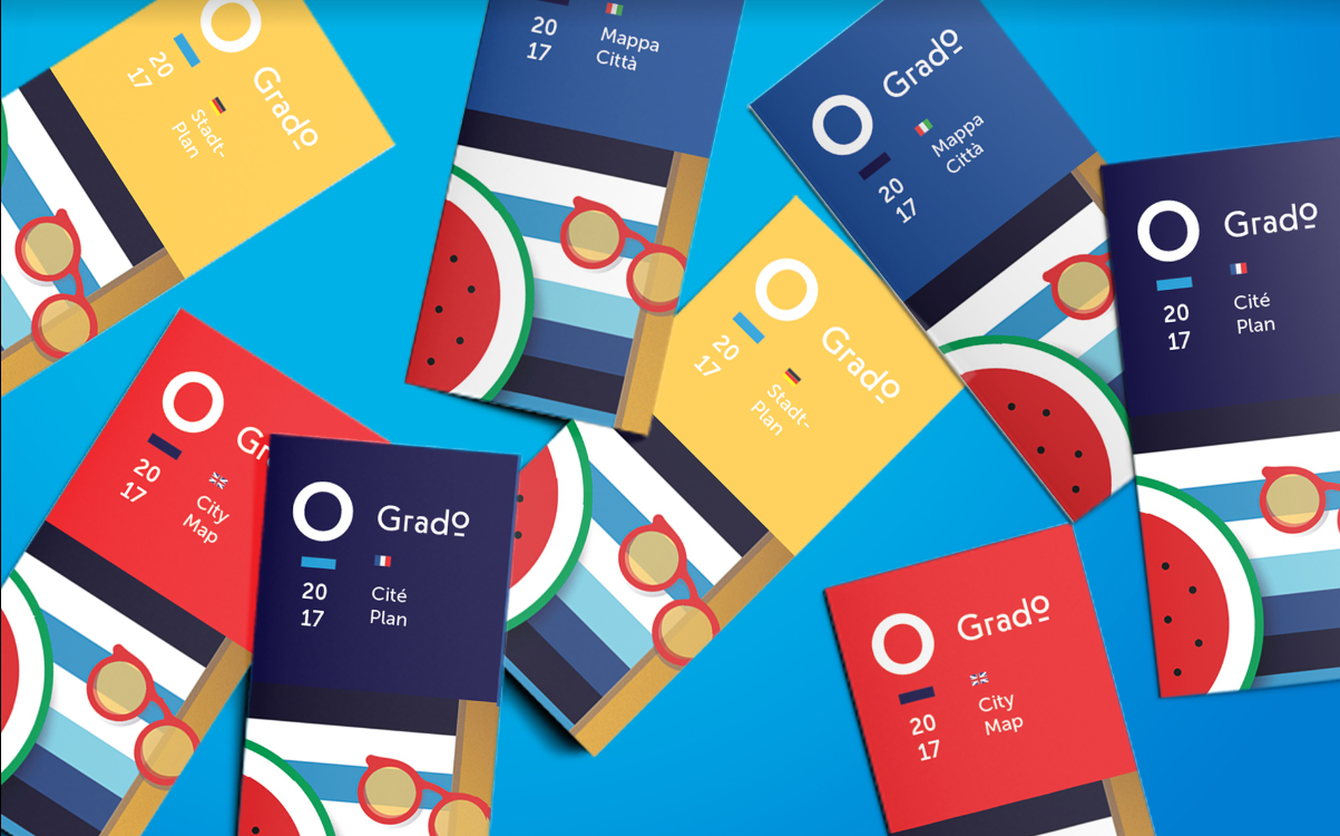
Source: Grado - Italy / City Branding and Web Design | Behance
How Designers Are Using It Today
Right now, bold colors are slowly creeping back into:
- Hero sections and call-to-action buttons
- Gradients that add depth without clutter
- Illustrations and micro-interactions that feel alive
- Accent elements that draw the eye and break monotony
Even small pops of saturated color can shift the perception of a page from safe to striking.
What It Will Look Like in 2026
2026 will be the year designers turn the volume back up.
- Expressive gradients.
- Layered, vibrant gradients will highlight hierarchy and mood instead of blending into background filler.
- Layered, vibrant gradients will highlight hierarchy and mood instead of blending into background filler.
- Saturated palettes.
- Brands will use color fearlessly to evoke emotion and signal interaction points.
- Brands will use color fearlessly to evoke emotion and signal interaction points.
- Contrast for clarity.
- High-contrast combinations will improve readability and make content instantly scannable.
- High-contrast combinations will improve readability and make content instantly scannable.
- Color-driven storytelling.
- Visual cues through color will guide users, reinforce brand identity, and make interfaces feel dynamic.
- Visual cues through color will guide users, reinforce brand identity, and make interfaces feel dynamic.
- Interactive color feedback.
- Hover, scroll, and gesture-based changes will make color feel alive, reinforcing engagement.
- Hover, scroll, and gesture-based changes will make color feel alive, reinforcing engagement.
Bold color grabs attention, conveys emotion, and reinforces identity. After years of muted neutrals, it allows your brand and interface to speak louder.
Quick Tip
Start with one bold accent per screen. Maybe a vibrant button, a gradient hero, or a single saturated icon. Let it lead the eye, evoke emotion, and give your design confidence.
7. Micro-Animations
Micro-animations aren’t new. But in 2026, they’re functional, purposeful, and memorable. Think subtle button bounces, toggles that feel tactile, or form fields that react gently when you type. We like to call it micro delight: small motions that make an interface feel alive.
It’s not about showing off animation skills. It’s about guiding attention, confirming actions, and creating joy.
Source: Emote Project | Dribble
How Designers Are Using It Today
Micro-animations are popping up everywhere, but mostly in experimental or high-end projects.
Designers are:
- Adding small reactions to button clicks or form inputs
- Using motion to guide the user’s eye naturally
- Creating feedback loops that confirm success or errors
- Enhancing illustrations or icons with subtle movement
Libraries like React Bits Animations or 21st.dev make these interactions easier to implement, so anyone can add motion without heavy coding.
What It Will Look Like in 2026
Next year, micro-animations will feel indispensable:
- Feedback-driven motion.
- Buttons, toggles, and form fields will react subtly to input, confirming action and guiding the user.
- Buttons, toggles, and form fields will react subtly to input, confirming action and guiding the user.
- Scroll and hover reactions.
- Small animations tied to gestures or movement will make interfaces intuitive and playful.
- Small animations tied to gestures or movement will make interfaces intuitive and playful.
- Accessibility-first motion.
- Motion libraries will allow everyone to experience subtle animations safely without overwhelming or causing discomfort.
- Motion libraries will allow everyone to experience subtle animations safely without overwhelming or causing discomfort.
- Storytelling through micro-moments.
- Each animation reinforces hierarchy, focus, or emotion, making scrolling or browsing more memorable.
- Each animation reinforces hierarchy, focus, or emotion, making scrolling or browsing more memorable.
- Brand personality in details.
- Even tiny bounces, sways, or rotations communicate tone and character without clutter.
- Even tiny bounces, sways, or rotations communicate tone and character without clutter.
Tiny details create big impressions. Micro-animations turn a functional website into an experience people remember. They make interfaces feel intuitive, alive, and human.
Quick Tip
Pick one interaction per page to animate purposefully: a button, toggle, or input field. Even a subtle bounce or color shift creates delight.
8. From UX to MX
It might not even look like a trend. But it’s quietly reshaping the web. As AI search engines, chatbots, and generative agents start replacing traditional browsing, websites aren’t just for people anymore, they’re for machines too.
We’ve spent decades optimizing UX, the human experience. Now we’re entering the era of MX, the Machine Experience. MX is about how meaning, hierarchy, and structure are interpreted by AI systems. Your design decisions now affect not only what humans see but also what machines understand, summarize, and present elsewhere.
How Designers Are Using It Today
MX is still emerging, but some early adopters are:
- Structuring content for AI readability, not just visual appeal
- Adding clear hierarchies and semantic HTML to improve machine interpretation
- Optimizing images, metadata, and microcopy for AI summarization
- Considering voice and conversational agents as part of the experience
Even if it’s invisible to most users, MX is already shaping discoverability, accessibility, and SEO in profound ways.
What It Will Look Like in 2026
By next year, MX will become a design principle:
- Structured content.
- Every heading, list, and section will be designed so AI can parse, summarize, and interact with it effectively.
- Every heading, list, and section will be designed so AI can parse, summarize, and interact with it effectively.
- Semantic clarity.
- Meaning, hierarchy, and context will guide both human and algorithmic understanding.
- Meaning, hierarchy, and context will guide both human and algorithmic understanding.
- AI-first navigation.
- Websites will consider how search engines, chatbots, and agents interpret flows to improve discovery and usability.
- Websites will consider how search engines, chatbots, and agents interpret flows to improve discovery and usability.
- Content signals.
- Design choices will highlight important information for both humans and AI, ensuring your message travels without distortion.
- Design choices will highlight important information for both humans and AI, ensuring your message travels without distortion.
- Adaptive metadata.
- Dynamic tags, labels, and structured data will make sites smarter and more discoverable.
- Dynamic tags, labels, and structured data will make sites smarter and more discoverable.
Machines are becoming first-class users of the web. Designing for MX ensures your content is understood, summarized, and surfaced where it matters. Ignoring it risks invisibility in an AI-driven web.
Quick Tip
Start small by structuring key content with clear headings, descriptive alt text, and semantic HTML. Even tiny steps make your site more readable for AI, which can amplify reach, relevance, and user experience all at once.
9. Immersive Visuals and the Human Touch
2026 is about websites that feel alive. Real experiences. Surprising moments. Human touches. Static layouts are out. Motion, imperfections, and playful experiments are in. This is the kind of design that keeps users curious, engaged, and coming back.
Experimental Navigation
Immersive scrolling, 3D transitions, spatial interfaces, non-linear paths. These interactions encourage exploration and make sites memorable without sacrificing usability. 60% of users are more likely to scroll to the end of a web page if it includes interactive scroll-triggered animations.
Scrolling Animations
Scrolling becomes storytelling. Elements fade, move, rotate as users scroll, creating rhythm and delight. Shopify's use of scroll-triggered animations led to a 12% increase in conversions by highlighting product features through subtle motion. Tiny touches, a spinning word, a sliding visual, a bouncing icon,make scrolling feel alive. Users stay longer, explore more, and remember your site.
Anti-Design and Embracing Imperfection
Asymmetry, overlapping visuals, bold type, and “human flaws” are no longer mistakes. They’re tools. They give your site personality, make it approachable, and connect with real people. Social media and experimental portfolios are proving that intentional imperfection is more memorable than sterile perfection. Authenticity now beats polish every time.
10. Bold Typography and Interactive Text
2026 is the year words take the spotlight. Typography is for grabbing attention, guiding users, and even making your site playful. Text can be the hero, and every interaction can feel alive.
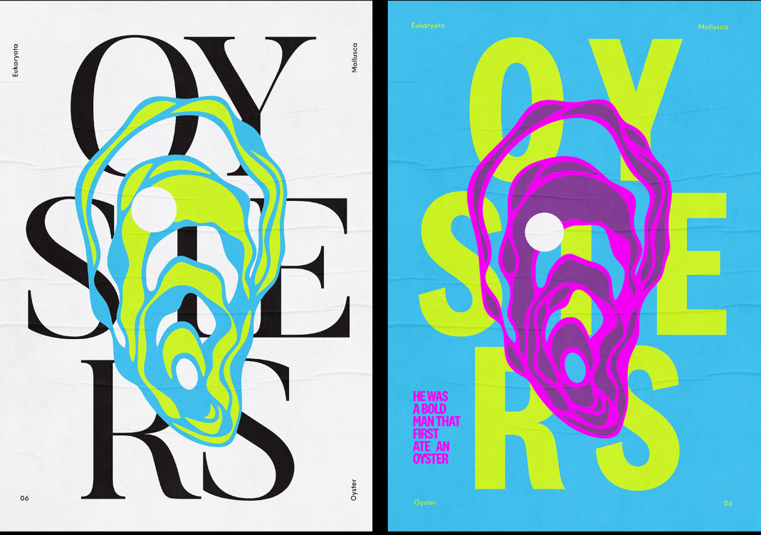
Source: Oysters Project | Behance
Text-Only Hero Images
Stock photos are out. Bold, striking type in the hero section hooks users immediately, delivering your message fast and clearly. Like newspapers used to put their biggest headline above the fold, your typography now anchors the story and pulls people in before they scroll.
Content-First Design
Everything starts with content. Web design specialists focus on making text and structure clear before adding visuals or effects. Progressive enhancement layers on polish without breaking accessibility or performance. The result is a site that looks good, works everywhere, and builds trust with users naturally.
Dynamic Cursors
Cursors are more than pointers. They’re tiny guides and playful companions. Dot cursors, trailing motions, gradient swirls, or flashlight effects help highlight details, steer attention, and make navigation feel intuitive.
Read next: 50+ key AI agent statistics and adoption trends in 2025.
Web Design Trend Cheat Sheet 2026
Need a fast snapshot of the biggest web design trends for 2026? Here’s your at-a-glance guide to what’s shaping the web, why it matters, and how to use it in your work.
Trend | Category | Why It Matters | Quick Example / Tip | Impact |
| AI-First Design | Productivity & Workflow | Speeds up workflows, boosts creativity, and accelerates iterations | Use AI to generate wireframes, UI copy, and layout suggestions | Faster prototypes, smarter decisions, more creative freedom |
| Responsive 3D | Visuals & Immersion | Adds emotion, depth, and interactivity | Use Spline or React Three Fiber to create 3D elements that react to scrolling or cursor | Higher engagement, memorable experiences |
| Ambient UI | Interaction & UX | Prepares experiences for multiple input methods beyond screens | Incorporate voice, gestures, and motion sensors | Inclusive, futuristic, device-agnostic experiences |
| Performance as Design | UX & Speed | Builds trust, retains users, and improves SEO | Optimize images, use burst-mode scrolls, functional motion, storytelling scroll | Faster, leaner, and more enjoyable experiences |
| Neo-Brutalism | Visual Style | Creates authentic, human, and memorable designs | Use asymmetry, bold type, and raw elements | Distinctive branding and standout portfolios |
| Bold Colors | Visual Style | Grabs attention, evokes emotion, and enhances storytelling | Use bold gradients, expressive hues, or saturated accents | More dynamic, recognizable, and engaging visuals |
| Micro-Animations | Interaction & UX | Increases satisfaction, guides attention, and adds delight | Add subtle button bounces, toggle reactions, or scrolling triggers | Memorable, intuitive, and tactile experiences |
| Machine Experience (MX) | Strategy & Structure | Ensures AI can understand and surface your content | Structure content with headings, semantic HTML, alt text | Improved AI discoverability, future-proofing content |
| Immersive Visuals & Human Touch | Visuals & Interaction | Makes sites feel alive, playful, and human | Use experimental navigation, scroll-triggered effects, or intentional imperfections | Longer engagement, more memorable user experiences |
| Bold Typography & Interactive Text | Visuals & Content | Puts messaging first, guides users, and elevates personality | Try text-only hero sections, content-first layouts, and subtle dynamic cursors | Clear messaging, stronger branding, interactive delight |
Conclusion
Stop designing for Behance. Start designing for humans.
The trends we covered are tools, not rules. Use them to amplify meaning, clarity, emotion, interacting and storytelling.
- AI can speed up your workflow, but it can’t replace intuition.
- 3D and immersive visuals will grab attention, but only if they guide and delight, not distract.
- Micro-animations and bold typography will spark emotion.
- MX thinking and performance-first design will make sure your work reaches everyone (humans and machines alike).
Every scroll, tap, and hover is a conversation with a real person. Treat it that way. Build interfaces that feel alive, intuitive, and human. Design with empathy, purpose, and courage.
➡︎ Looking to master these cutting-edge design trends? Index.dev connects skilled developers and designers with remote opportunities at companies building the future of web design. Whether you're deep into AI-first workflows, responsive 3D, or performance optimization, we help you find roles where your skills shine.
➡︎ Need developers who can bring these 2026 design trends to life? Index.dev helps you hire vetted front-end developers, UI/UX designers, and full-stack engineers who know their way around AI-powered tools, 3D frameworks like Three.js and Spline, performance-first architecture, and modern design systems.
➡︎ Want to explore more insights on building high-performing web and tech teams? Check out our guides on 5 best AI models for frontend development, frontend developer skills assessment, 10 fastest-growing tech skills to master, 10 high-income tech skills that pay six figure salaries, and remote developer jobs & hiring trends in 2025 to stay ahead in design, development, and hiring trends. Dive deeper into these practical resources and stay ahead of the curve with Index.dev's expert guides.
